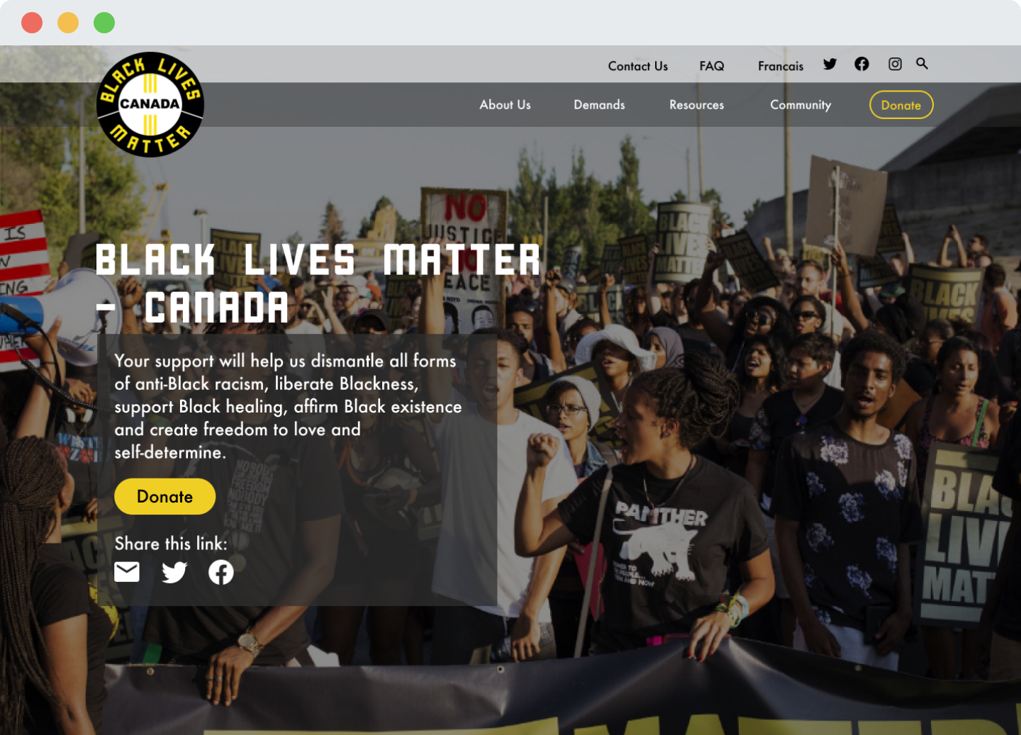
Black Lives Matter - Canada

A 3-week long research into a website redesign concept.

Black Lives Matter (BLM) is a global organization, whose mission is to actively dismantle all forms of anti-Black racism and white supremacy. BLM aims to build local power to intervene in violence inflicted on Black communities.

Role: Concept, Course Project (User Experience), User Researcher, and UI Designer
OVERVIEW

Black Lives Matter is a global organization, whose mission is to dismantle all forms of anti-Black racism. BLM aims to build local power to intervene in violence inflicted on Black communities.

We chose to focus on a redesign to provide BLM-Canada a more credible website, generating higher traffic and donations. Additionally, organizing the information will also help educate the masses on systemic racism within our society.

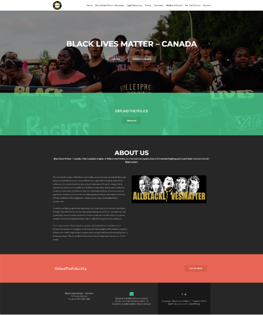
Image to the right below was the previous website design.

OBJECTIVE

Redesign the website to improve user experience, increase traffic and donations.

Redesign Black Lives Matter Canada’s current website layout into a more modern and cohesive collection of information. The general feedback from users was the website was “too unorganized” with information.

USER RESEARCH

A survey completed by 30 participants, primarily 25-35 years of age and have donated to non-profit organizations.

The questions were identify donating behaviour, participants research method on non-profit organizations, and how they determine credibility of a non-profit organization. The responses were collected in the form of multiple choice and short answers to get more insights at an early stage.

Here are some of the key findings.

89%

Offer monetary donations

75%

Believe content layout impacts their decision to donate

80%

Believe structure of content reflects credibility

93%

Research organizations before deciding to donating

USABILITY TESTING

We conducted usability testings to get a better understanding of the problem.

Here are some of the main points of concern from the users.

Unclear terminology and ineffective messaging

Inconsistency in information and content layout made the website lose credibility

Felt overwhelmed due to the amount of information provided

Labeling of navigation and hierarchy of information was confusing and deterred users away

HEURISTIC EVALUATION

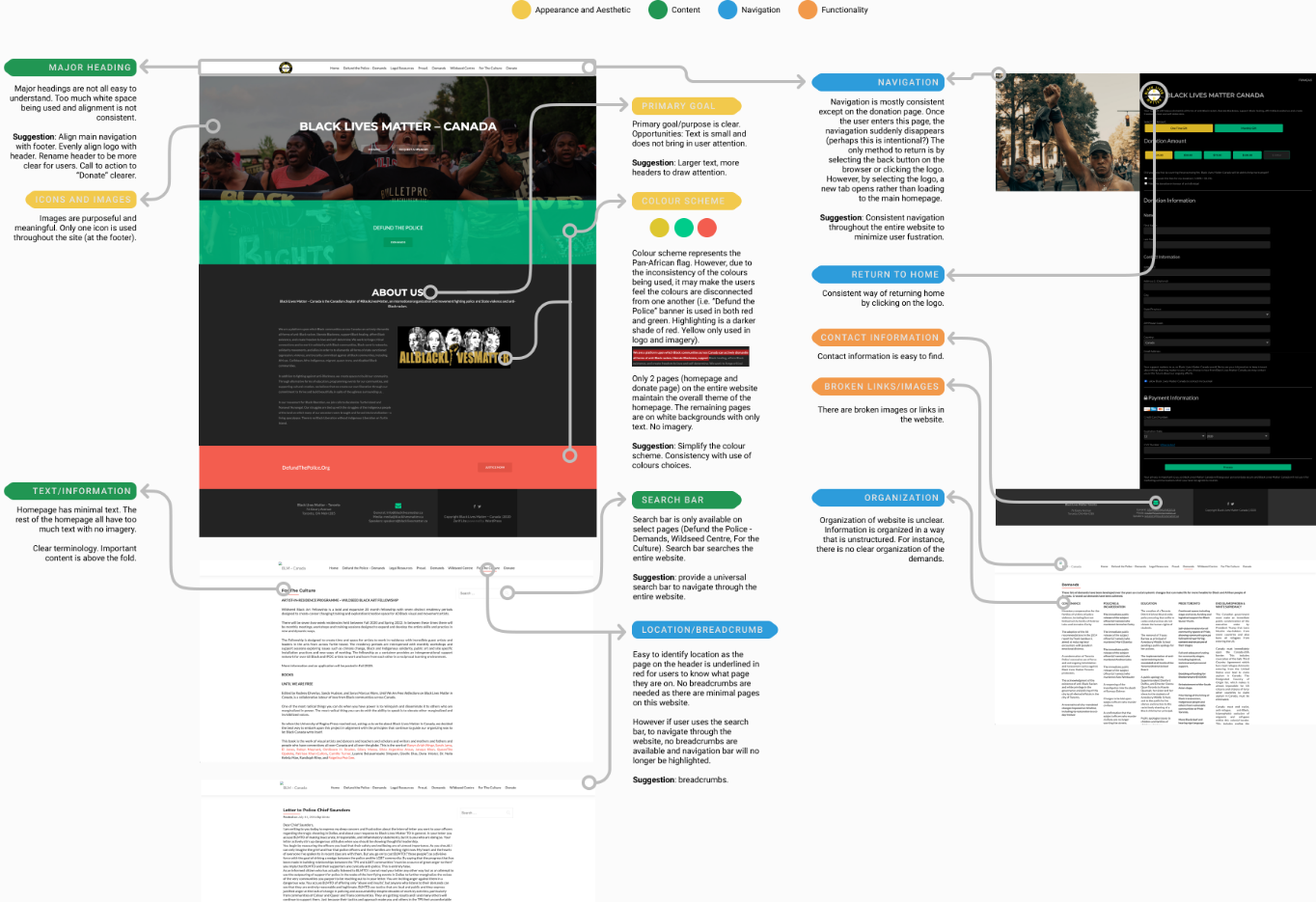
With a heuristic evaluation, we discovered many layout concerns such as small texts and inconsistent themes. Bigger problems arose from usability, such illegible and scattered content and broken links.

PROBLEM

Black Lives Matter is an organization that is viewed as an extreme activist group to some, which would deter some people from learning and supporting the movement.

How can we design a website that will engage its audience to increase donations and inform visitors of their objectives?

CARD SORTING & SITEMAP

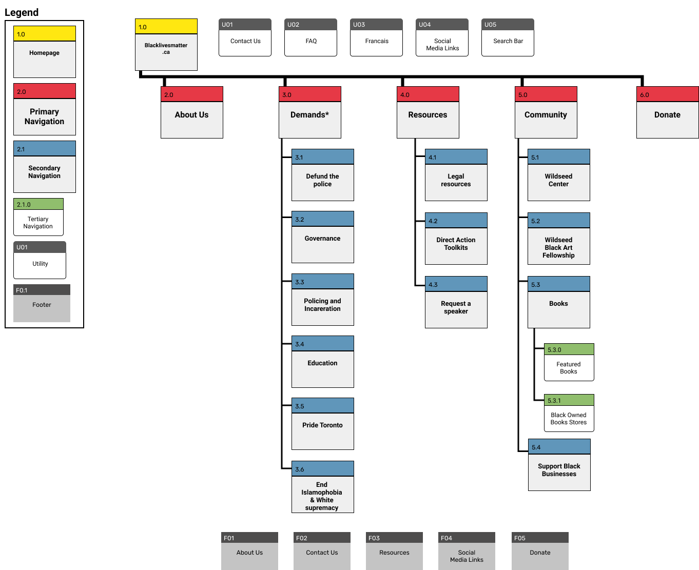
To improve upon the information architecture of the website, hybrid card sorting sessions were conducted with 12 participants.

With a heuristic evaluation, we discovered many layout concerns such as small texts and inconsistent themes. Bigger problems arose from usability, such illegible and scattered content and broken links.

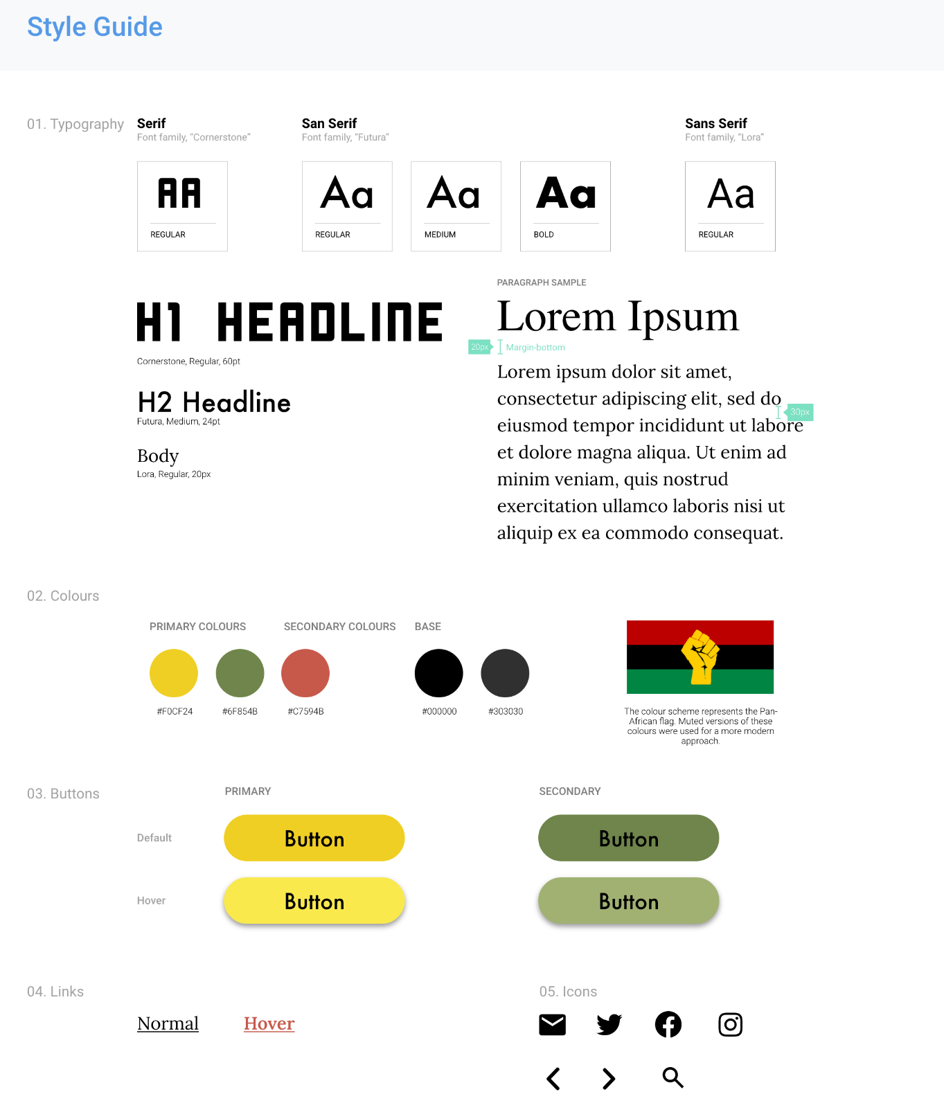
STYLE GUIDE

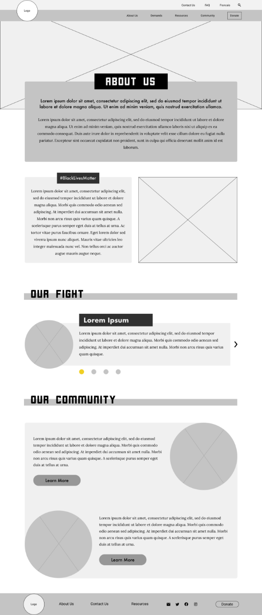
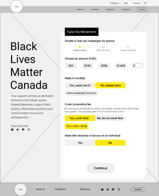
MID-FIDELITY WIREFRAME AND USABILITY TESTING

Keeping the user’s needs and pain points in mind, sketches were created that transitioned into a digital, mid-fidelity wireframe to begin usability testing to further identify any technical issues with content layout, visibility of information, navigation, and engagement.

Images below are scrollable

BLM Mid-Fidelity Homepage
BLM Mid-Fidelity Demands
BLM Mid-Fidelity About Us
BLM Mid-Fidelity Donate

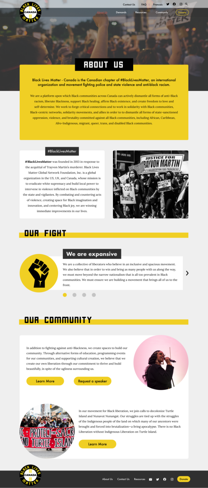
FINAL UI DESIGN

The design is met with impactful imagery and heavy fonts to generate a powerful impression of the personality and brand of Black Lives Matter.

Images below are scrollable

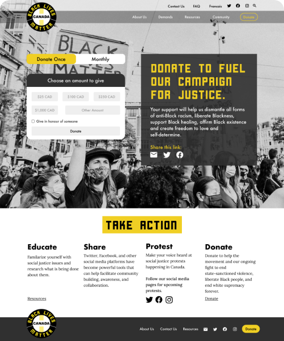
Hompage

As most users does a quick research about a non-profit organization, the homepage was designed to have all relevant information available. Users are able to donate without exiting the homepage by selecting the “Donate” button available on the hero image.

BLM Homepage

About Us

This page is used to further describe what BLM-Canada is about, their association with the BLM international organization. Creating a consistent design throughout the website was critical as familiarity builds trust with visitors.

BLM About Us

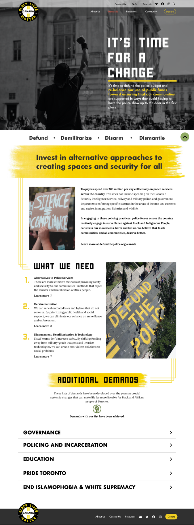
Demands Page

This page is introduced with a powerful image and statement message, “It’s time for a change”.

The phrase, “Defund the Police”, may be perceived with a negative connotation, therefore, as visitors scroll, there is a more explicit definition of the phrase - to invest in alternative approaches to creating spaces and security for all.

BLM Demands

Donate Page

The donation page was designed to resemble the homepage. It was kept very simple with an impactful hero image. As visitors scroll down, they’ll be met with a small section that offers other methods of supporting the movement.

BLM Donate

CONCLUSION

From the research, we discovered donors must have full transparency with the allocation of their contributions. Unfortunately, we were unable to find information of that sort. To further develop this project, it’s critical to know where the donations are allocated to develop trust and encourage progression in its fight for change.

After many attempts, we were unable to contact the stakeholders of BLM-Canada. This would have been extremely helpful in developing our case study with full facts. Hopefully, in the future, we can establish contact and develop this project further.