A 3-week long research into a redesign concept for Coca-Cola's Corporate US website.
Coca Cola is an iconic American Brand that is globally recognized by 94% of the world’s population and has a product portfolio of more than 3,500 beverages and 500 brands. The Coca Cola company has an estimated worth of $74 billion.
Role: Concept, Course Project (User Experience), UI Designer, FE Developer
PROBLEM
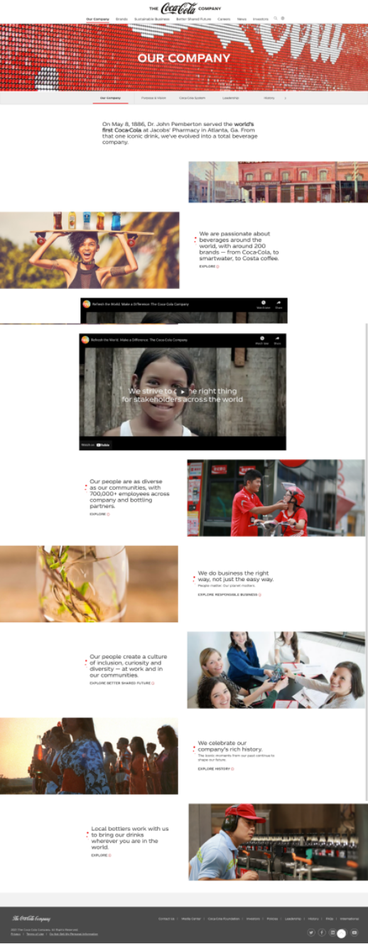
The Coca-Cola Company corporate website (coca-colacompany.com) was designed to inform their audience of their business objectives, values, and goals. We have observed that the website isn’t meeting these goals effectively, which is causing an increase in bounce-rate and decrease activity time.
Additionally, the corporate company website comes across as more of a publicity stunt that is inconsistent with its brand identity and information.
Images to the right below was the previous website design.
SOLUTION
We believe redesigning the website for Coca-Cola will better inform visitors about their corporate social initiatives, different brands under the Coca-Cola umbrella, and better align the website design towards their brand identity to make it feel less like a PR stunt.
My task was to research and design Coca-Cola Company’s website centered around a message of social responsibility while assimilating its brand identity.
RESEARCH METHODOLGY
Usability Testing
Competitive Website Analysis
Heuristic Evaluation
S.E.O. Analysis
USABILITY TESTING
Here are some of the main points of concern we discovered from the users.
Testers were skeptical of Coca-Cola’s initiatives and found the information unreliable
Some texts are not legible
Overwhelmed by multiple large imagery and lack of white-space
Testers were skeptical of Coca-Cola’s initiatives and found the information unreliable
COMPETITIVE ANALYSIS
Redbull, PepsiCo, and Coca-Cola aim to communicate their company culture, ethics, and social responsibilities. Relative to these competitors, Coca-Cola there is a missed opportunity at presenting information in a scannable and engaging format.
Here are some discoveries found from the analysis.
Difficulty reading and following content
Ineffective messaging
Inconsistent layout throughout pages
Users found it untrustworthy and not credible
S.E.O. ANALYSIS
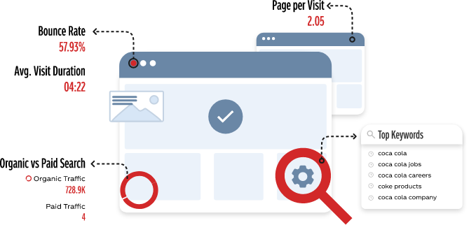
Although Coca-Cola had a lot of organic traffic and their page visits were higher than its competitors, average visit durations were shorter by more than half.
Therefore, indicating users are unable to find the information needed, get frustrated, and eventually exit the website altogether.
HEURISTIC EVALUATION
Key findings from performing the evaluation.
Design flow of pages were inconsistent throughout the entire website
No appropriate use of white space
Despite text being short, they were difficult to read over some images
The overall loading time was slow due to the website having repetitive pages and broken links
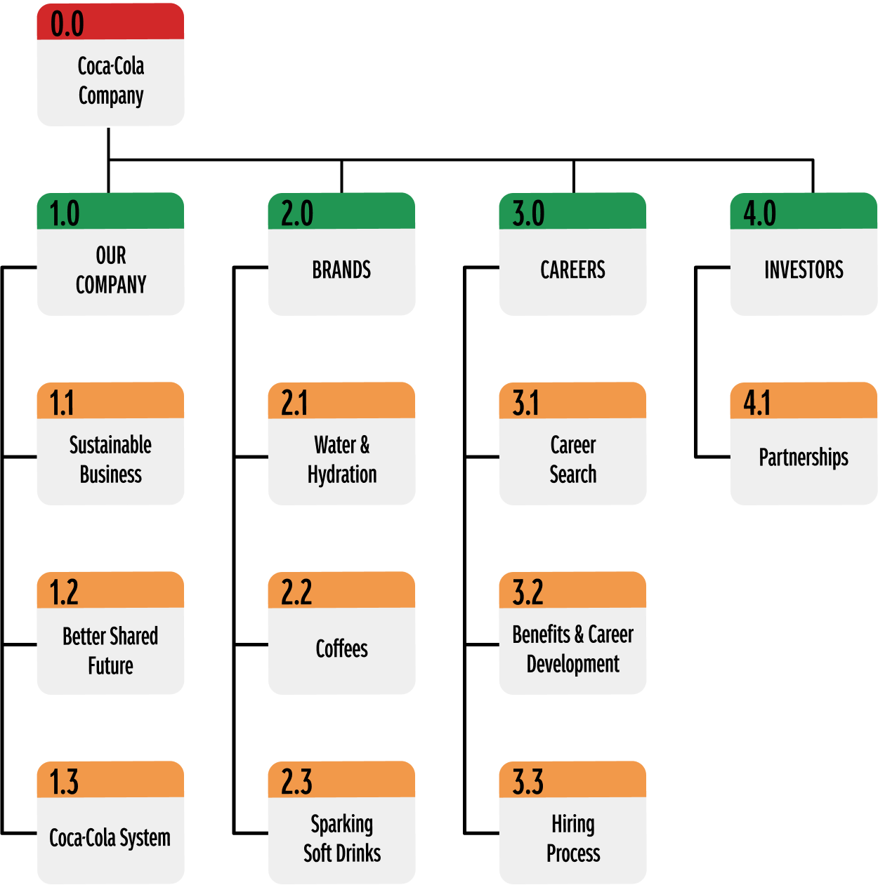
INFORMATION ARCHITECTURE
MID-FIDELITY WIREFRAME
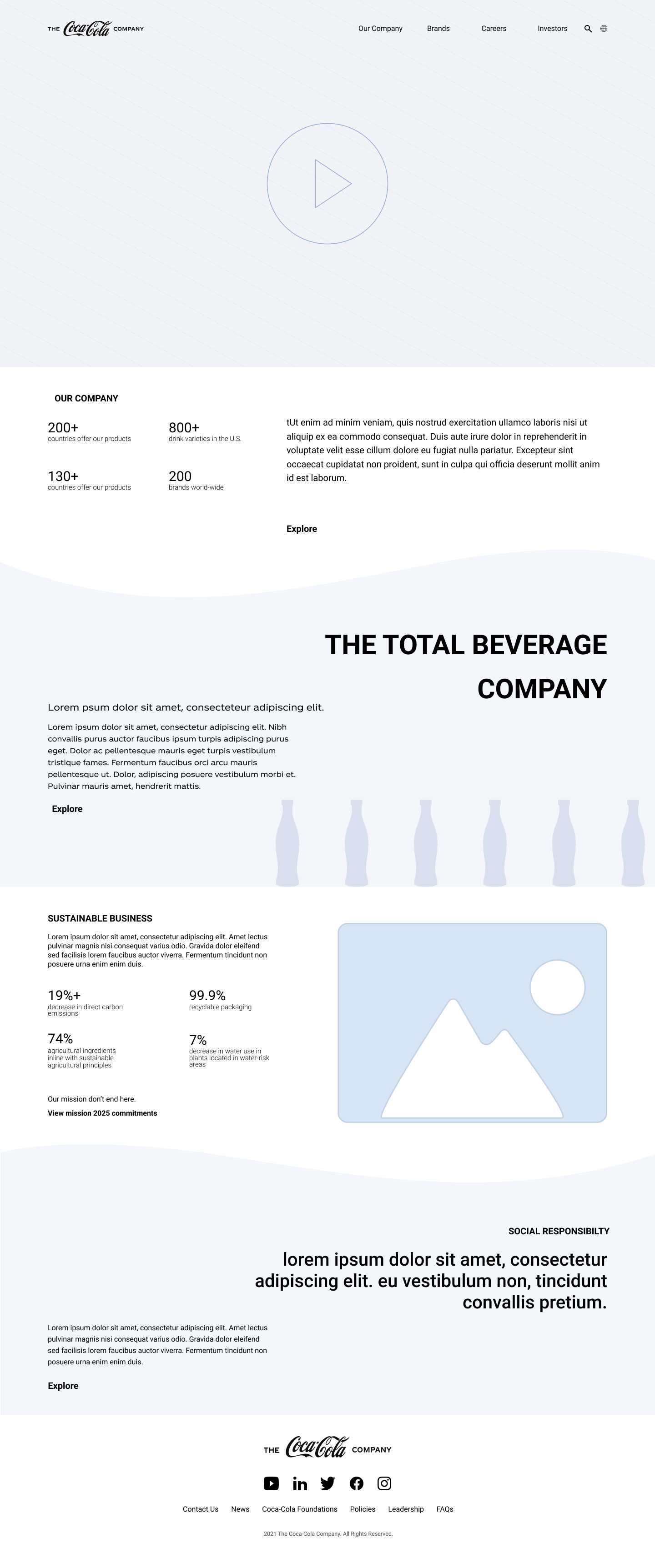
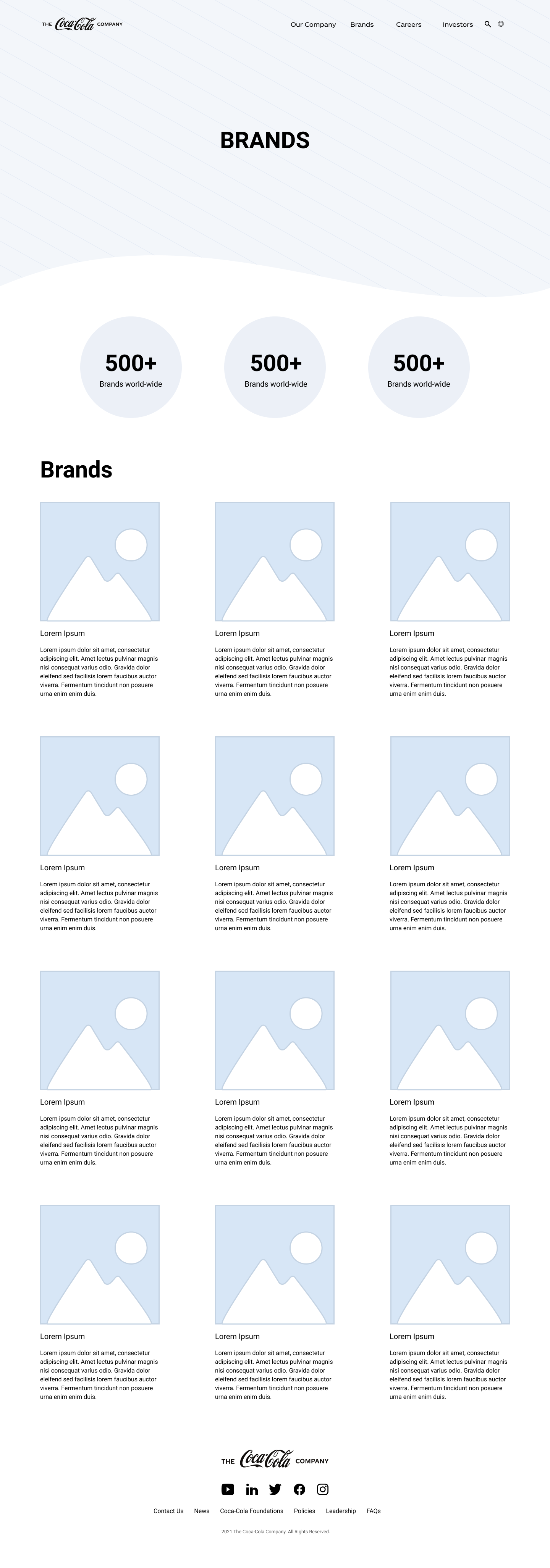
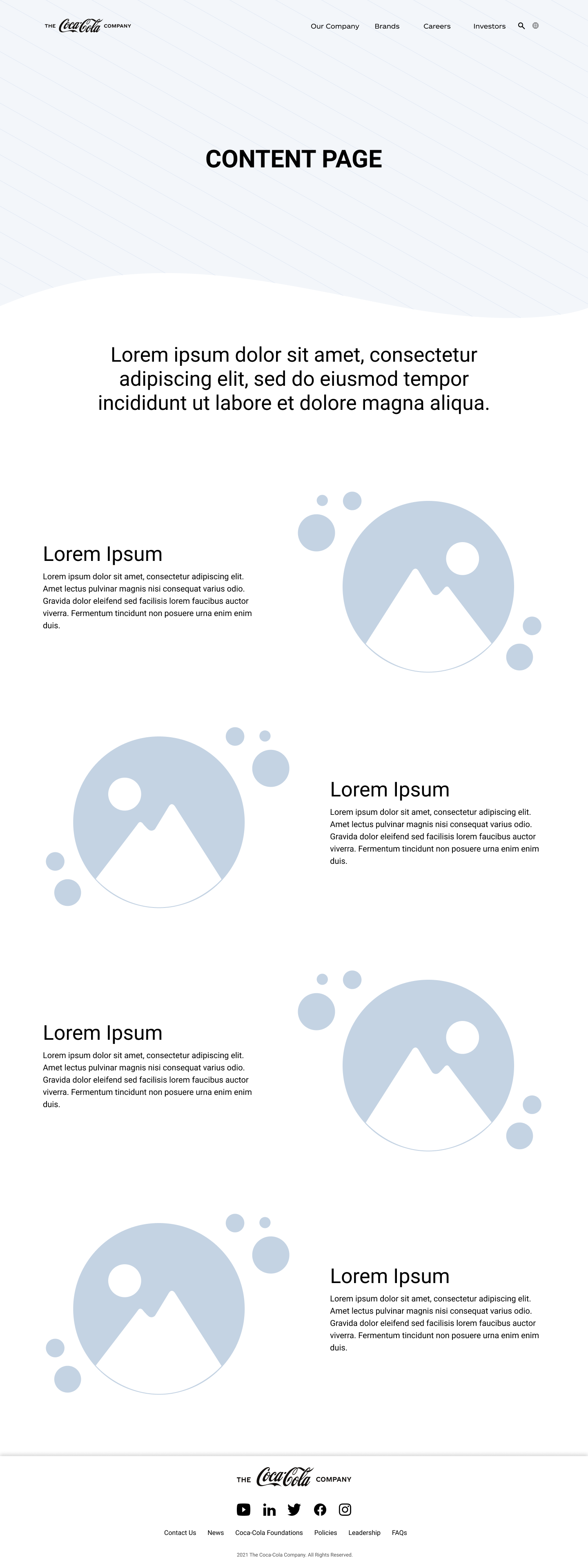
Based on our SEO search, we focused on redesigning the most visited pages: Homepage, About Us, Careers, and Brands.
Images below are scrollable
USABILITY TESTING
But more importantly, we needed to observe the testers’ perceptions when learning about Coca-Cola’s initiatives towards social and environmental impact. Without asking, we wanted to determine if people perceived it as a publicity stunt.
Successfully, no one mentioned that the redesign felt like it was a PR stunt. However, after analyzing the data, we chose to prioritize these changes:
Cultivating a deeper trust
Create more compelling visuals
Secondary Navigation more visible
FINAL UI DESIGN
Languages used: HTML5, CSS3, and jQuery
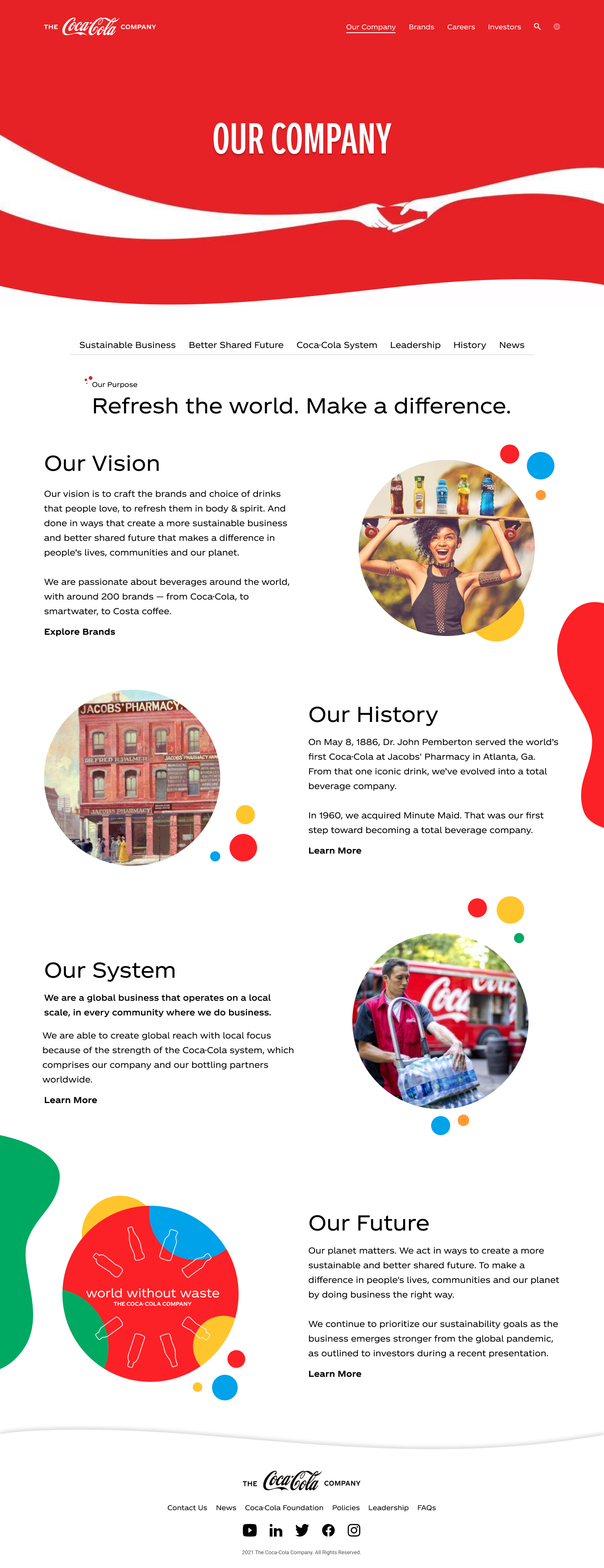
Images below are scrollable
Rather than an image, we opted for a video embodying the Coca-Cola lifestyle. Because people are highly visual, a video adds a personal touch that immediately builds credibility and trust.
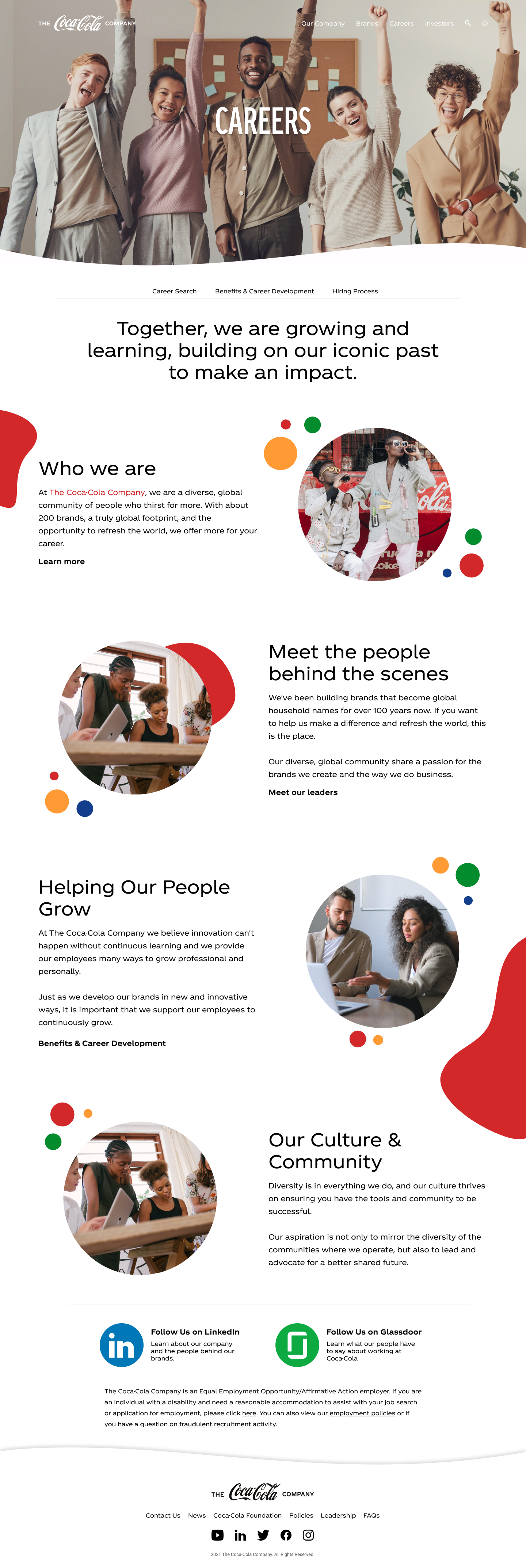
As most visitors are searching for career opportunities, we structured the content layout to suit that audience.
This page is used to further describe what BLM-Canada is about, their association with the BLM international organization. Creating a consistent design throughout the website was critical as familiarity builds trust with visitors.
For the remaining pages, we needed to generate a positive impression. The intention was to draw out certain emotions such as enthusiasm, positivity, inclusivity, and openness. This is illustrated through imagery, eccentric bubbles, and bright colours.
CONCLUSION
Optimizing the content of the website was this project's biggest challenge, which we could overcome by consolidating information, restructuring content layout, and modifying the information architecture. Iterative user research led to a final product that reduced contradictory and repetitive content.
During the project, I worked on user research, prototype design, UI design, and FE development. Currently, we are working on improving interaction elements based on continued feedback and analytics tracking.